Wake Up
The First Tide project came about through work to develop an identification for environmentally sensitive products being sold by a major retailer. The project took a detour and I was left with this mark. I was inspired to imagine an alternate brand and identity around the mark based on the research I did. I then began to imagine the world it would live in.

The origins of the mark were strongly rooted in smartly produced products, including many liquid cleansers. Personally, the mark spoke of clean water and healthy ocean initiatives. I imagined a company that would be thoroughly invested in these causes and came up with First Tide, a surf culture, earth-healthy, style brand.
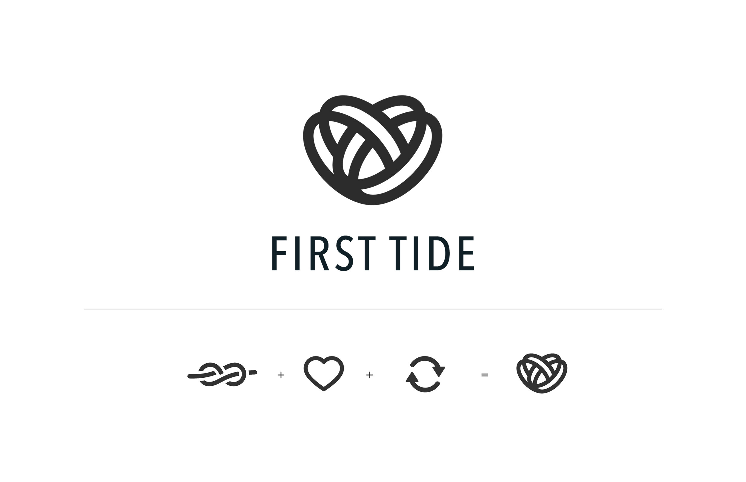
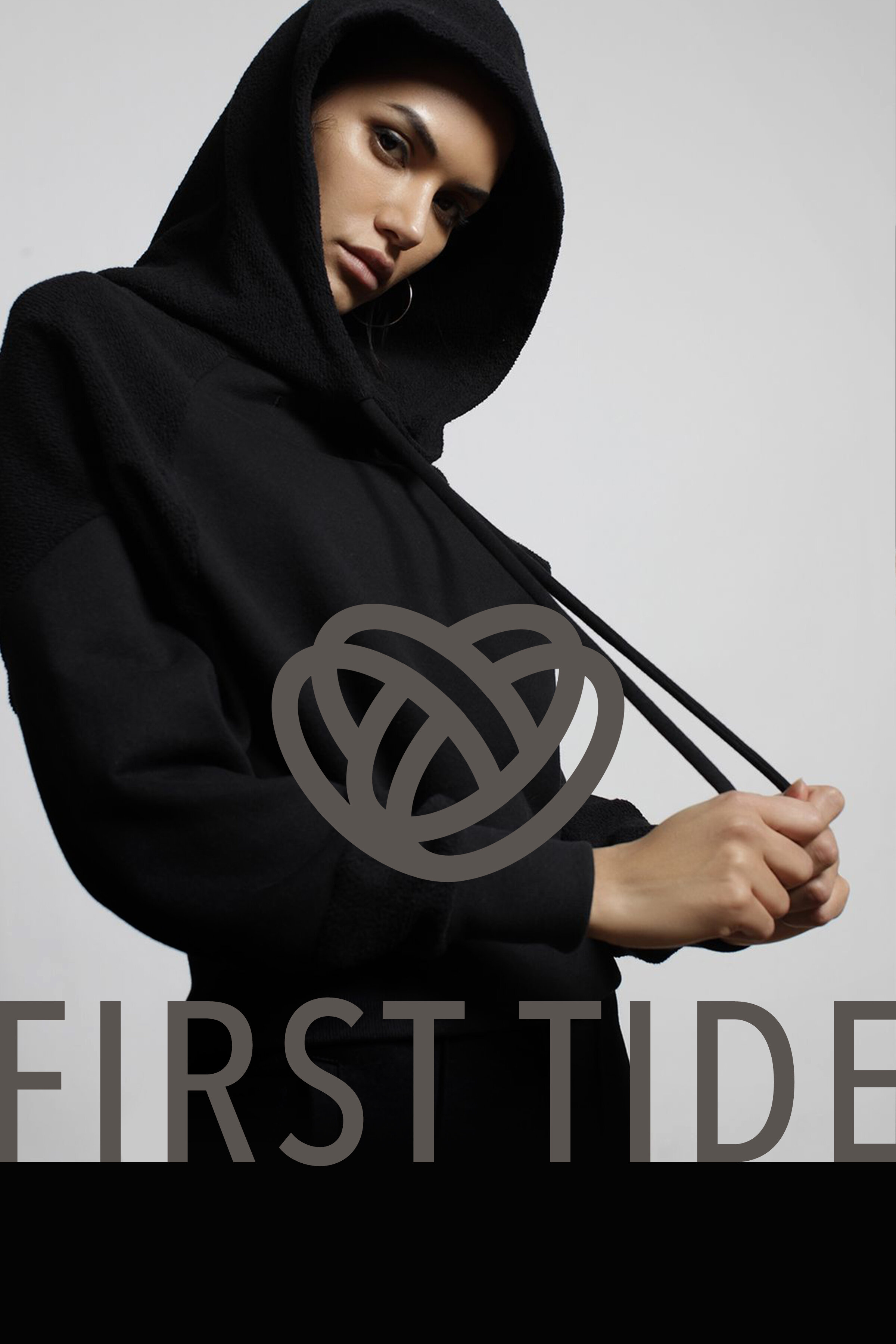
The logo’s foundation is set in three initiatives: connectivity, passion and taking action. Connectivity is represented by a knot, which has an eons long history representing unity, respect, and nature. The heart is unmistakeable for symbolizing passion and compassion. And the turning arrows suggest cycling, movement, and progress..
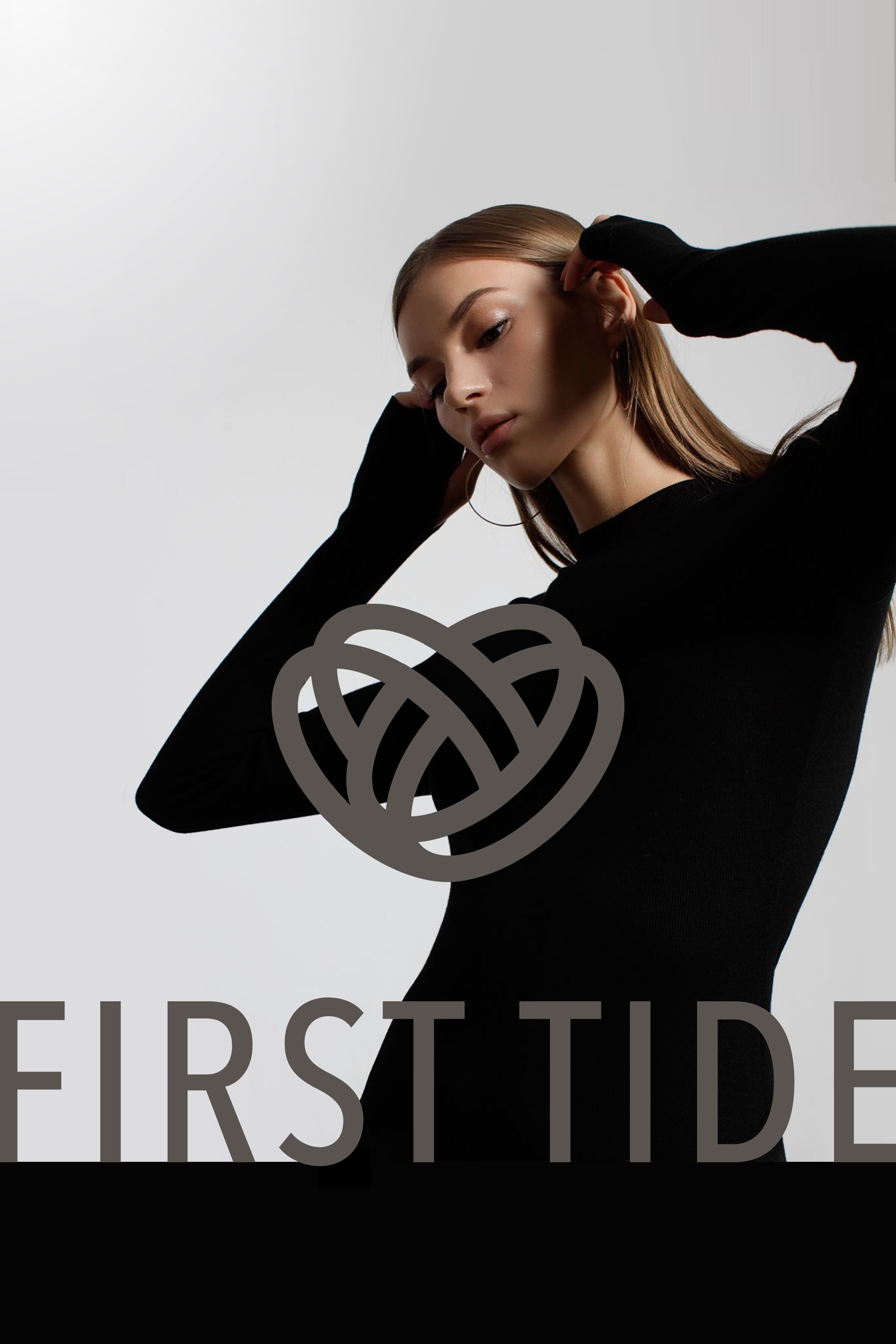
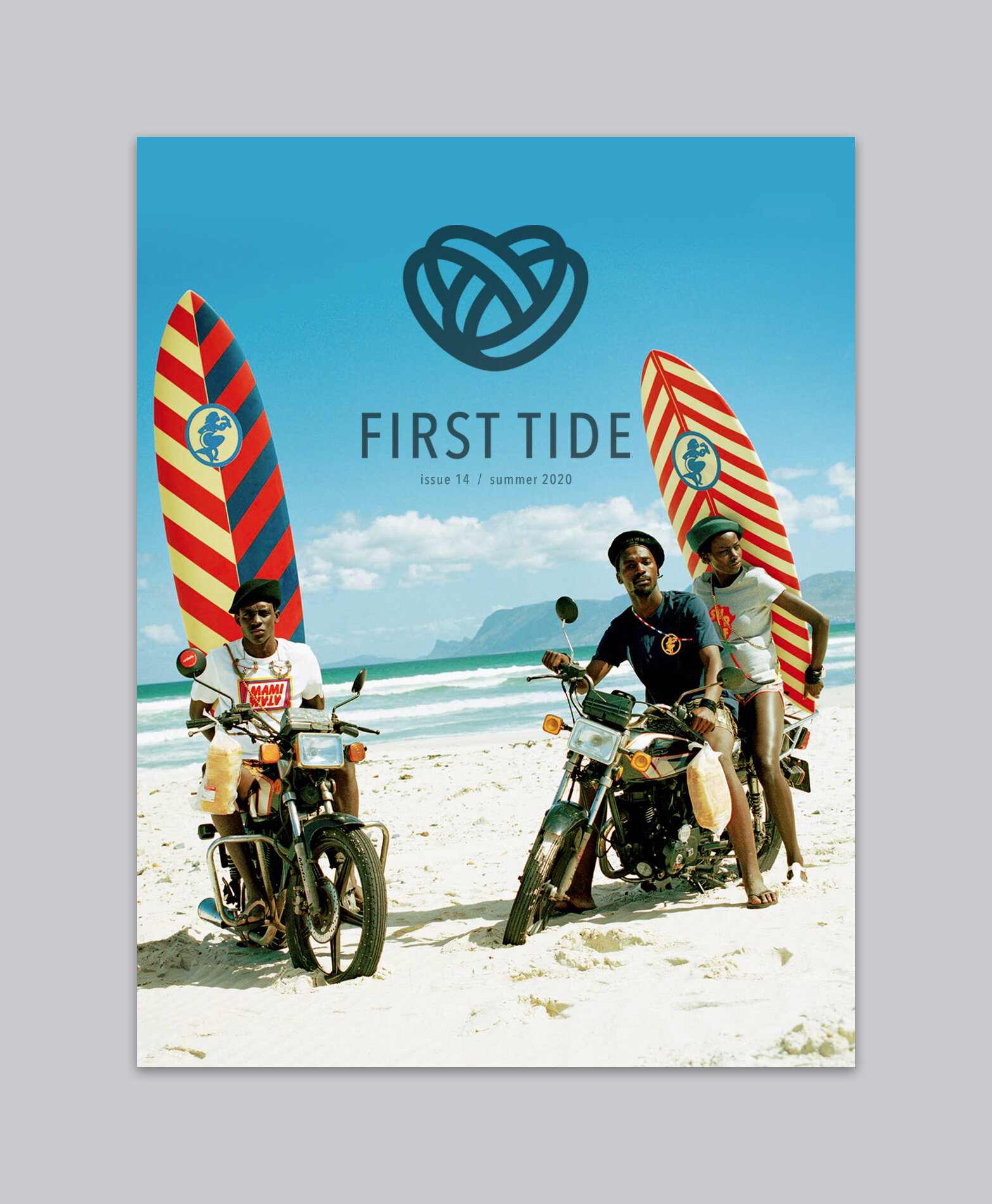
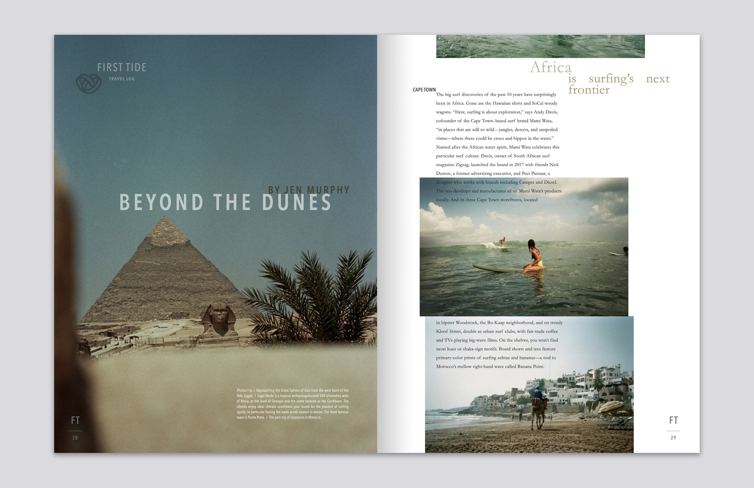
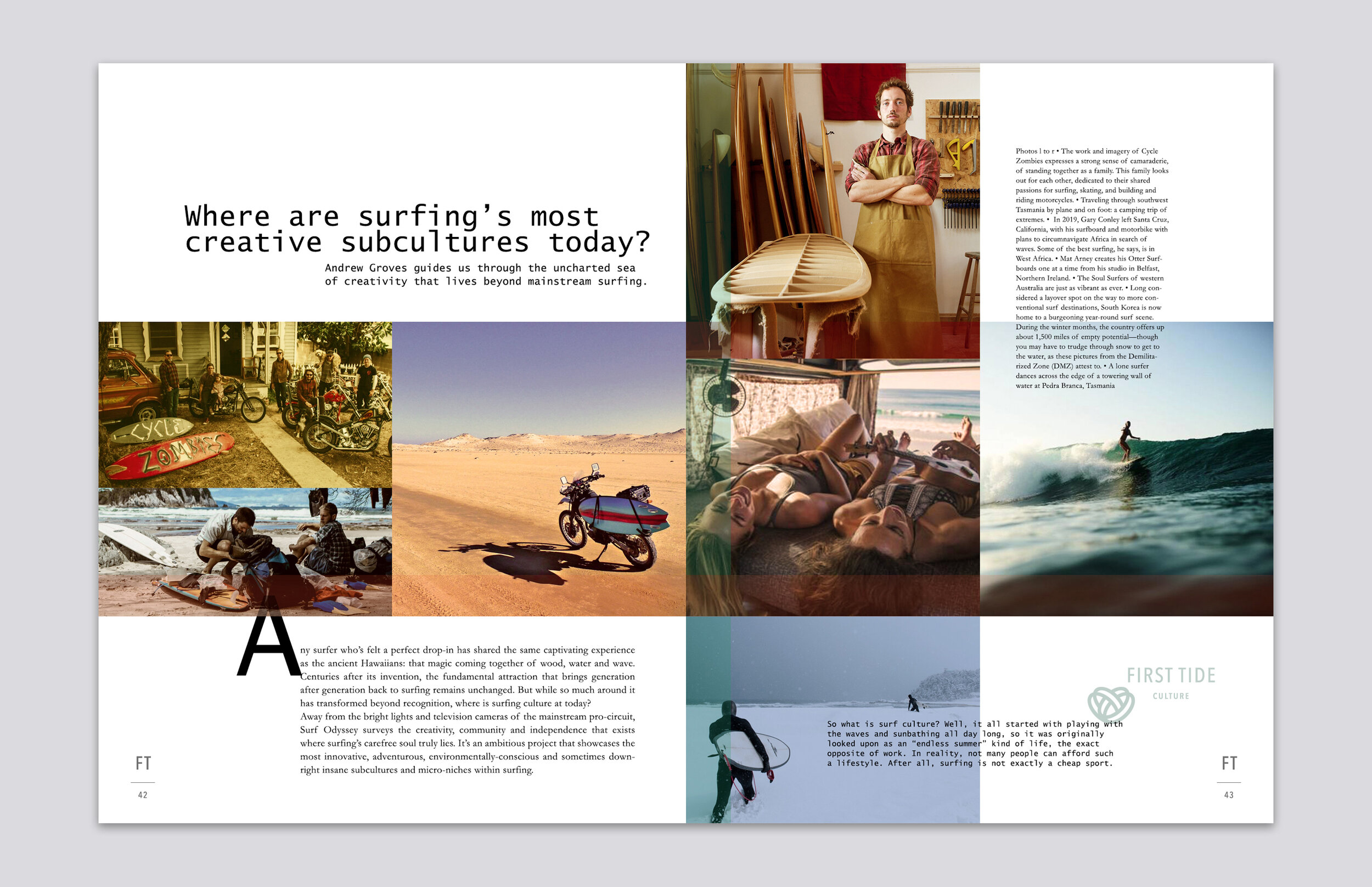
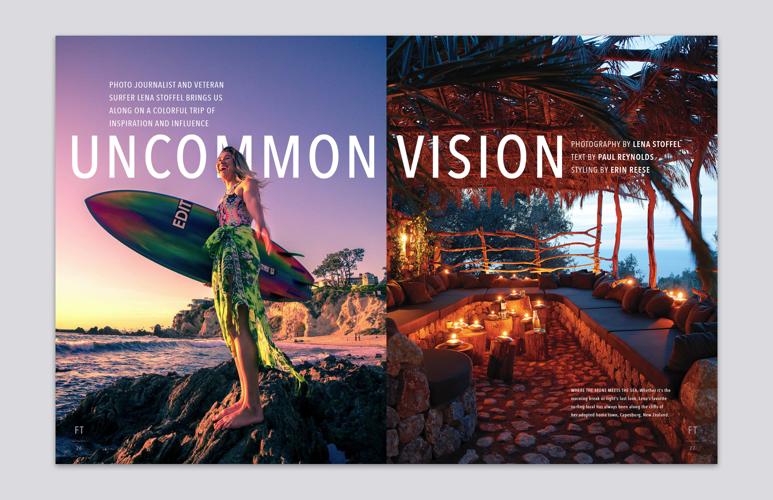
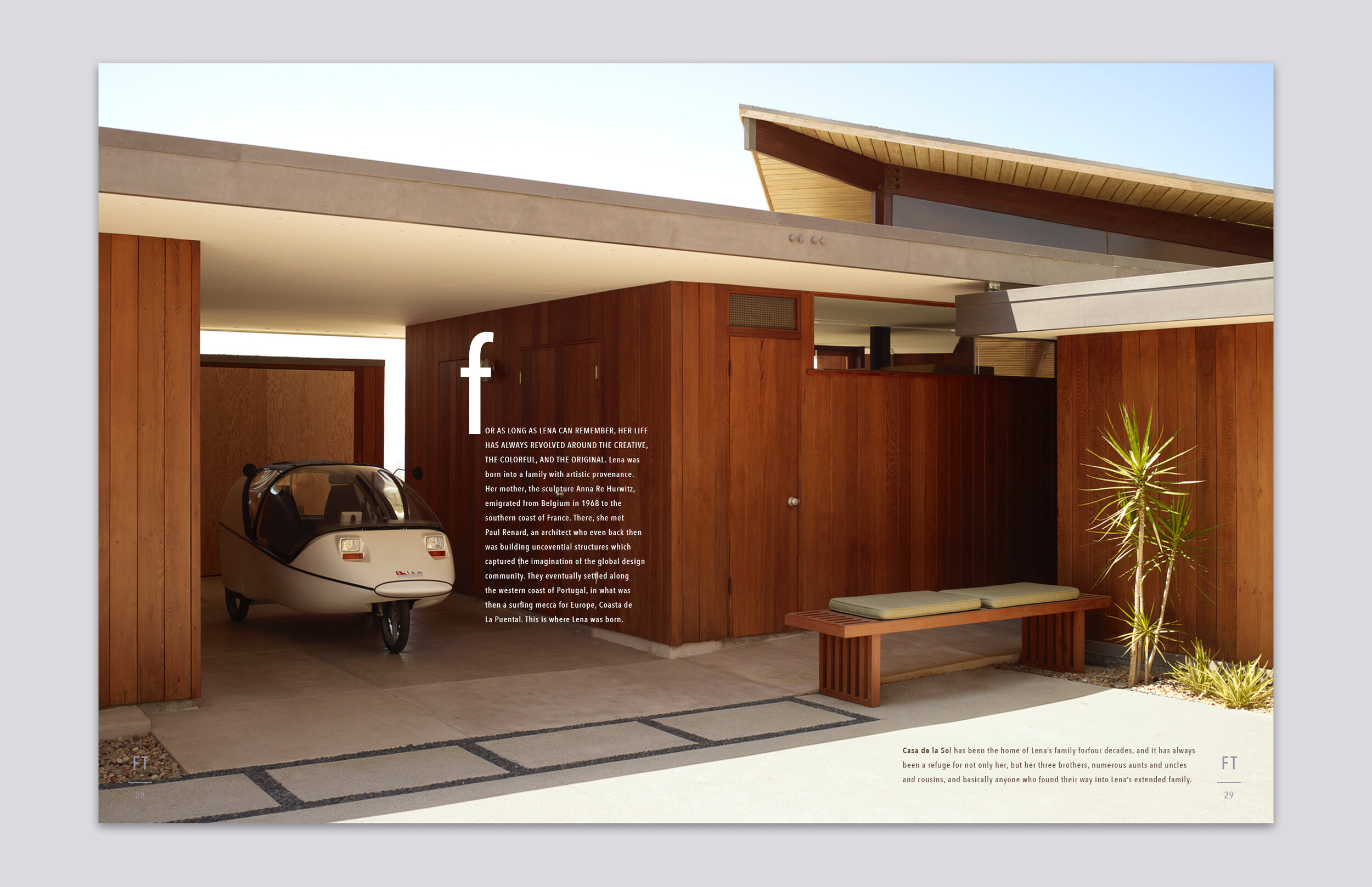
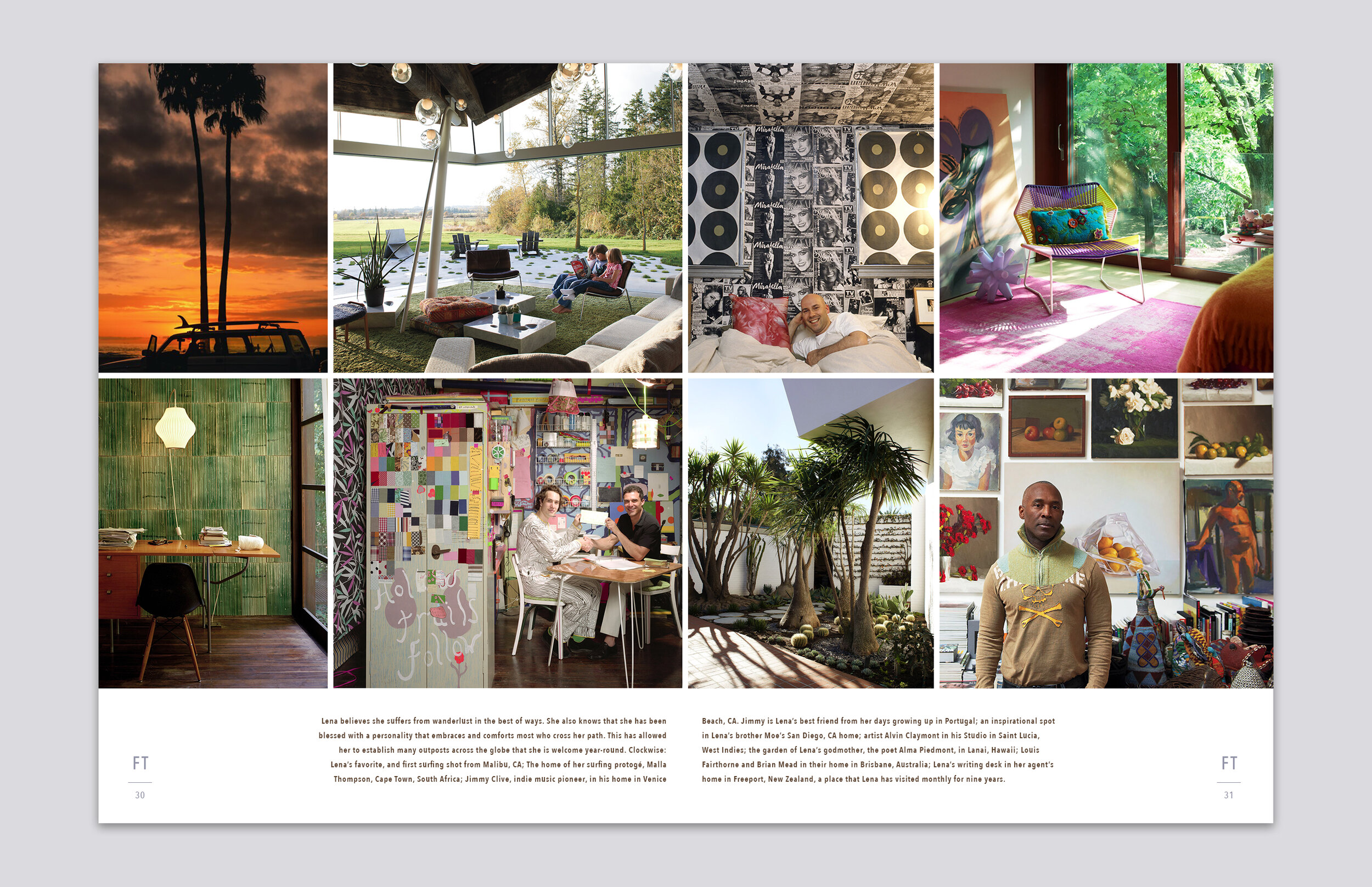
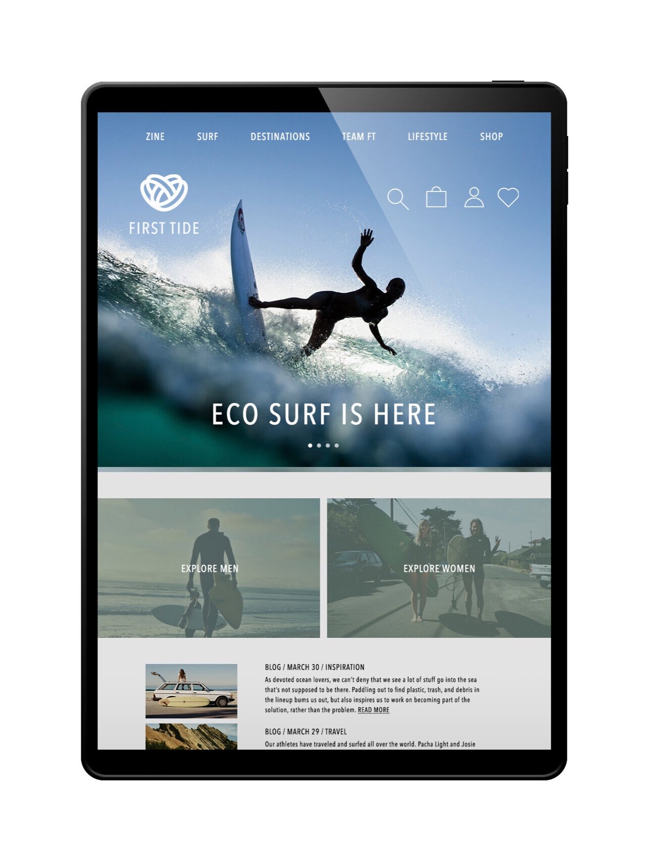
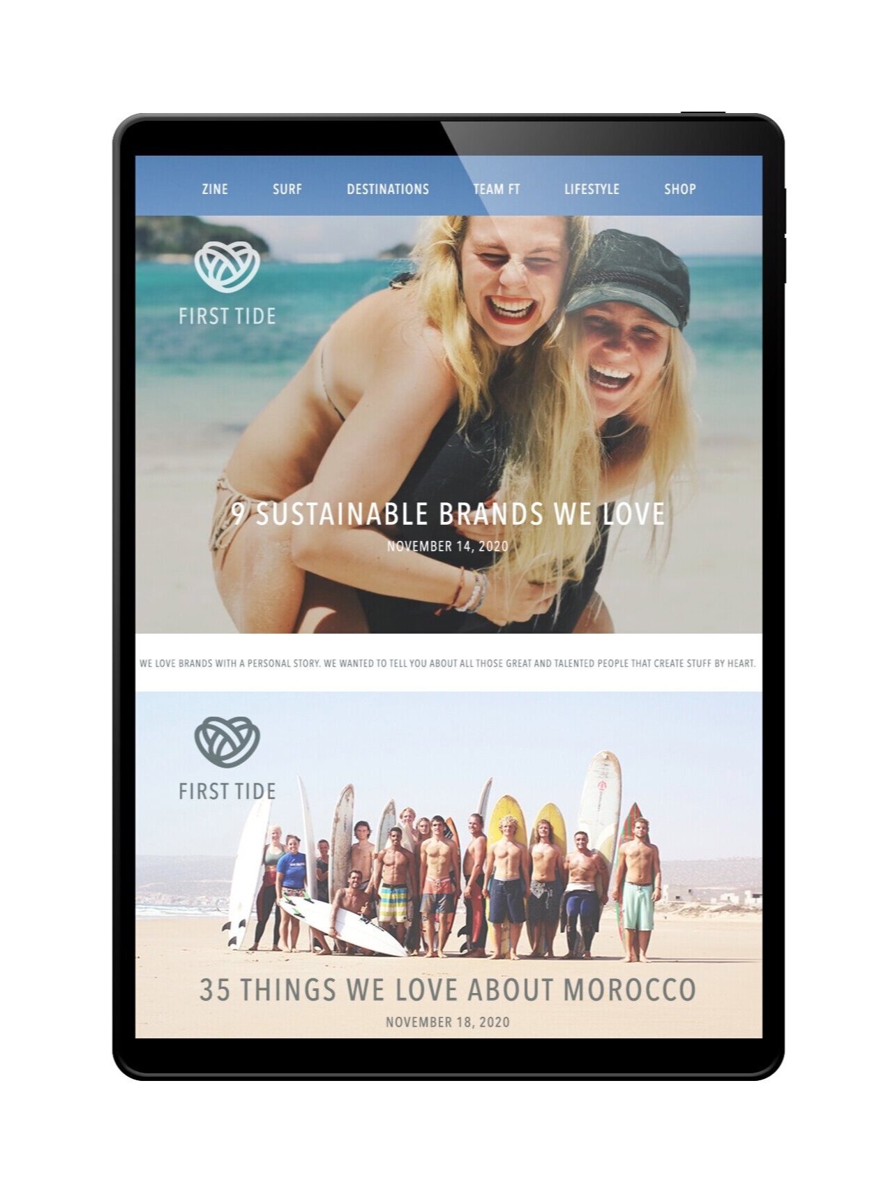
I envisioned a storytelling-based catalog that showcased product through its community of users, and an app that educated as well as advised what gear was right for you.
